Airbnb iOS app, a critical review and verdict
Hi everyone,
In today's post we are going to be looking at the design of Airbnb iOS app and reach a few conclusions about what might have went wrong there. As an experienced iOS developer and regular app user I think I can try and provide reasonable feedback.
I am in love with Airbnb, and together with my wife use this service daily to communicate with our guests. I have been complaining about the iOS app everyday for the last two years, went to Airbnb open, complained there but still no change. After a few months of pain I have finally found the time to write about it. The experience is the same for guests as it is for hosts (arguably the host app experience is even worse).
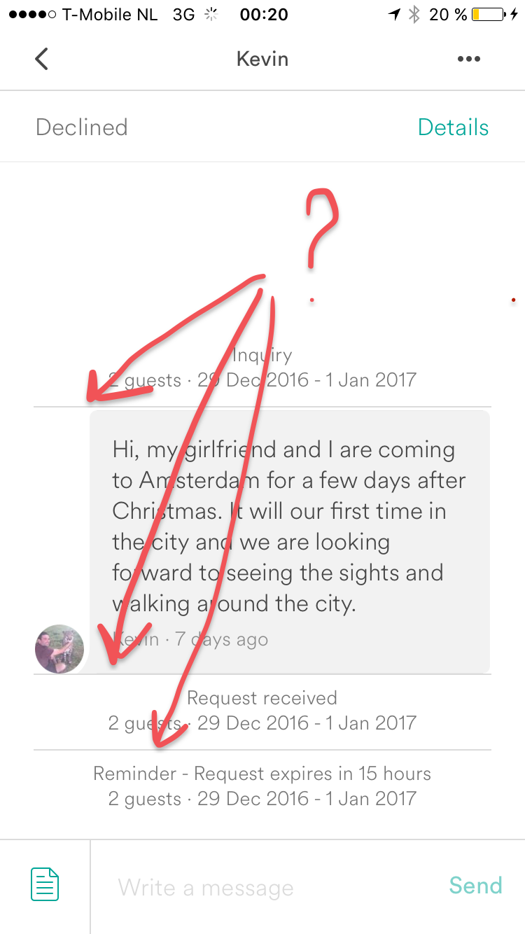
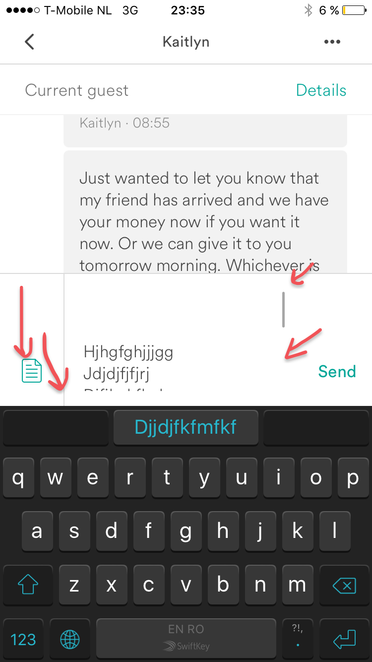
Let's dive in. App version 16.42.1 (latest) iOS version 10.1 (latest). We start by communicating with our guest/host. Notice the 3 horizontal lines between messages. Why are they there?
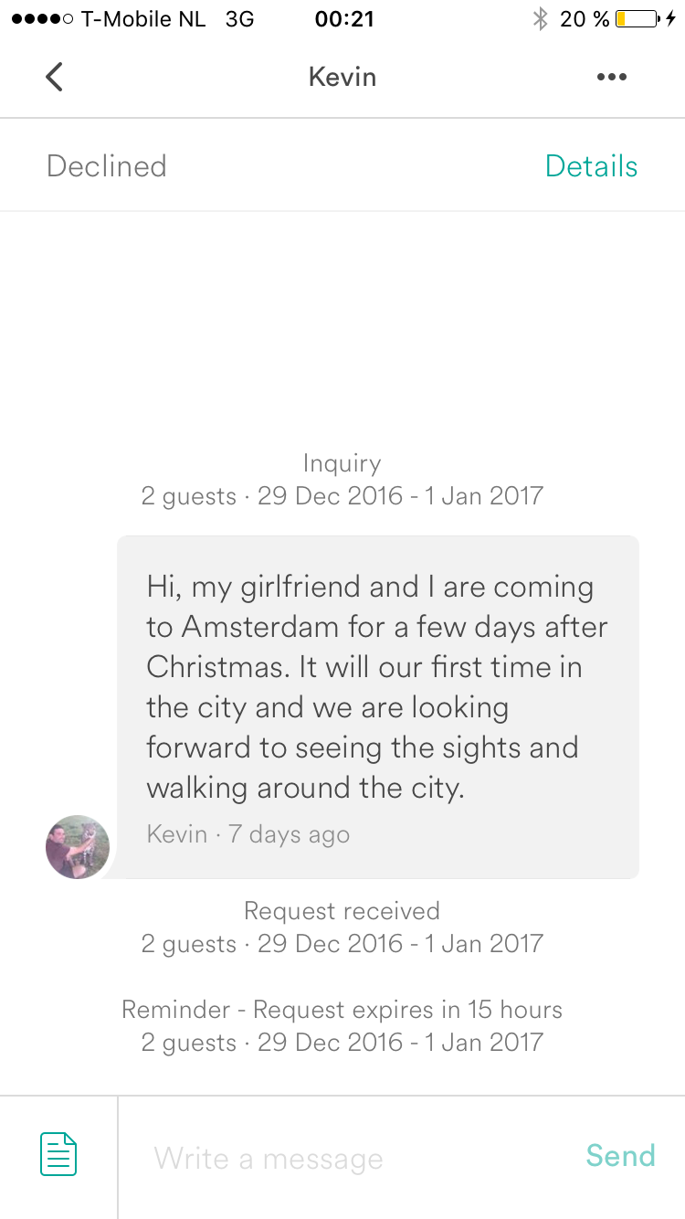
We don't know. Let's try and scroll a little bit and see if they disappear:
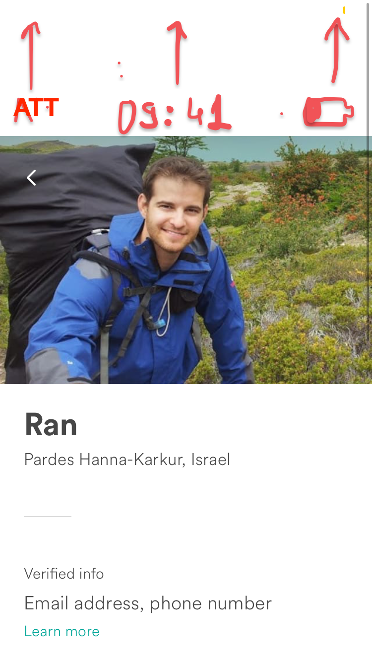
It's magical. They are gone. Well this is just careless programming. You should remove separators between cells if needed. Let's continue to another guest, this time let's open his profile. Let's try and scroll a little bit. A white UIStatusBar does't really make sense if the background is white. I drew what's missing for the Airbnb folks.
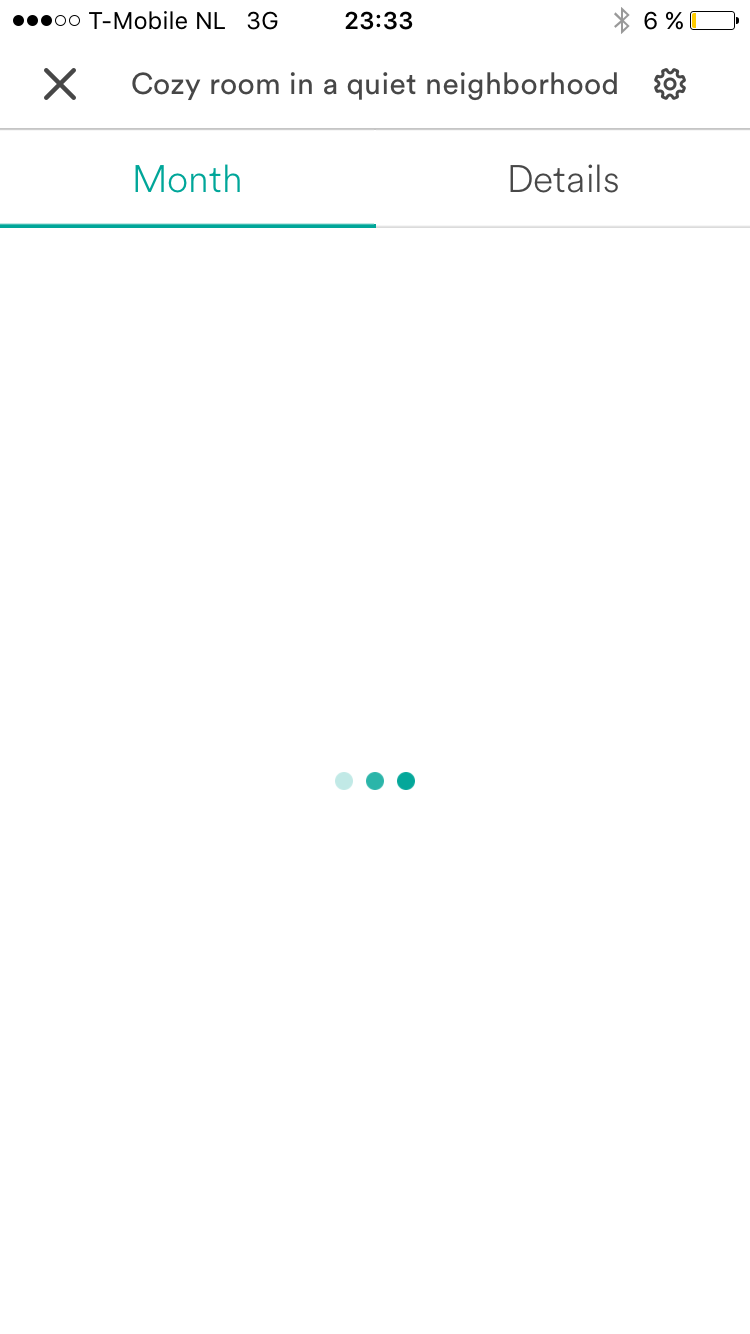
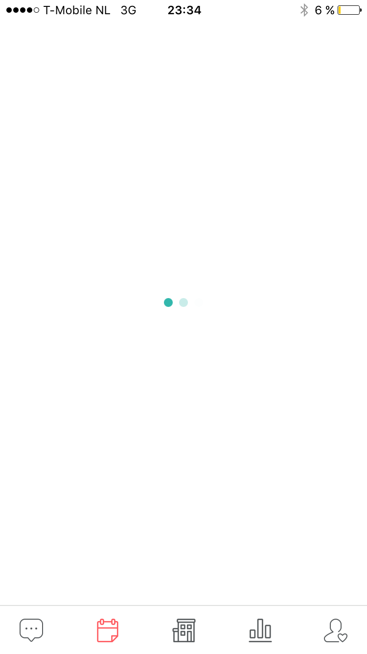
Now let's go into a reservation and tap View on Calendar. It's loading something. The loading indicator itself is not very helpful as it tends to load for very long times.
But after it finishes it wants to load some more:
Advice: Once you show a loading indicator , load everything you need. Our guest is waiting at the door though, lets talk to him. White spaces, and insets for the scroll indicator. White spaces everywhere.
Next, lets go back to our calendar and try to refresh it, by performing the popular pull-down-to-refresh action. We expect the circular arrows to spin until they finish refreshing. But no.
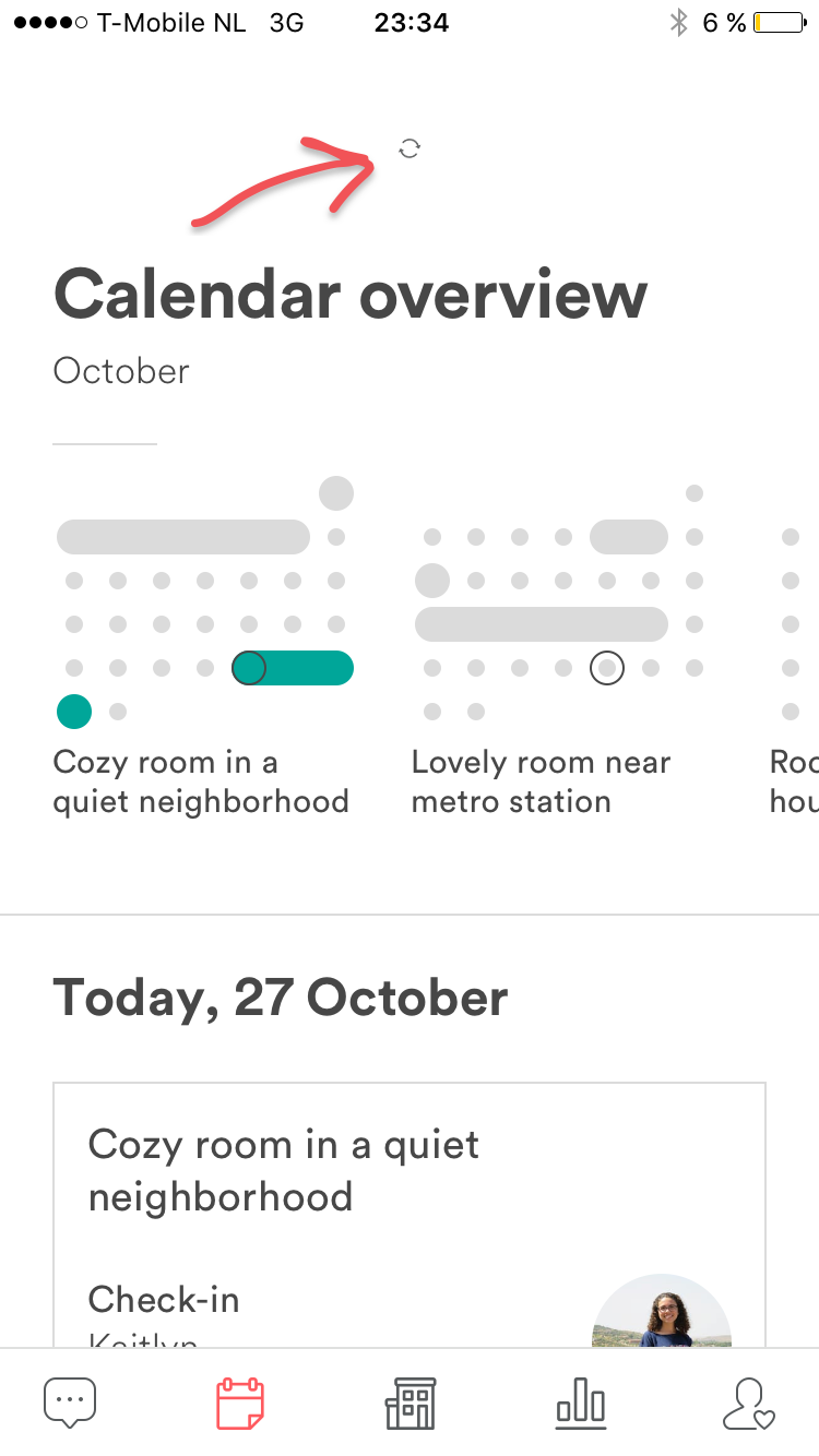
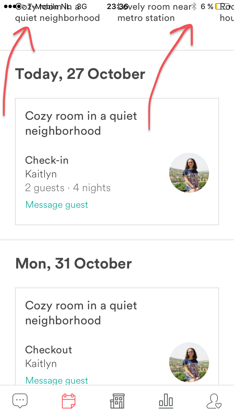
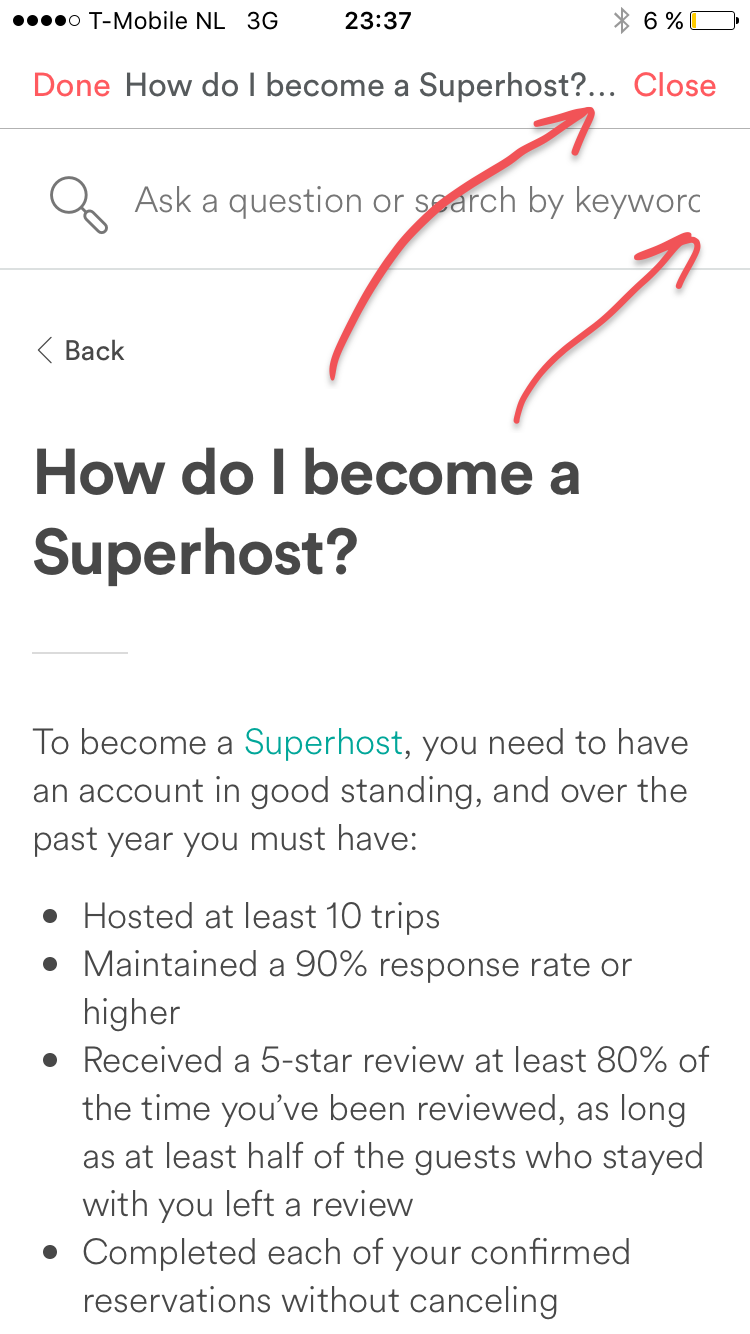
Well, lets scroll a little bit in the calendar tab. UIStatusBar discipline is completely ignored by Airbnb. Anything goes:
As well as the notion of text fitting screens (even if the screen is the latest one Apple launched) and the app is in English. Just imagine how bad it must be in other languages, where developers tend to not test that much:
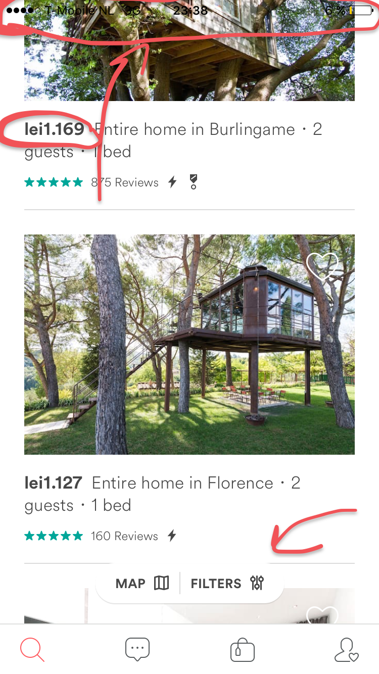
I hear you! You're saying, maybe the iOS app for hosts sucks. But the part which is for guests must be great. Check this out. Currency formatting (there are so many nice apis for this) is wrong. Status Bar, dead wrong, Map and Filters buttons overflow the white content, not sure when the button ends and the backgrounds starts.
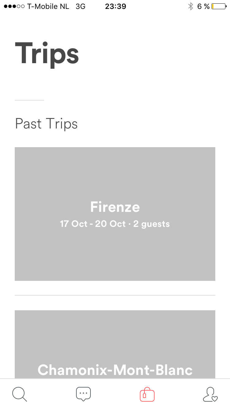
Lets check out our trips. No pictures. Huh. Waiting doesn't help. Oh right, scrolling might help.
Woooaah. It only loads images after opening a trip. Let there be light:
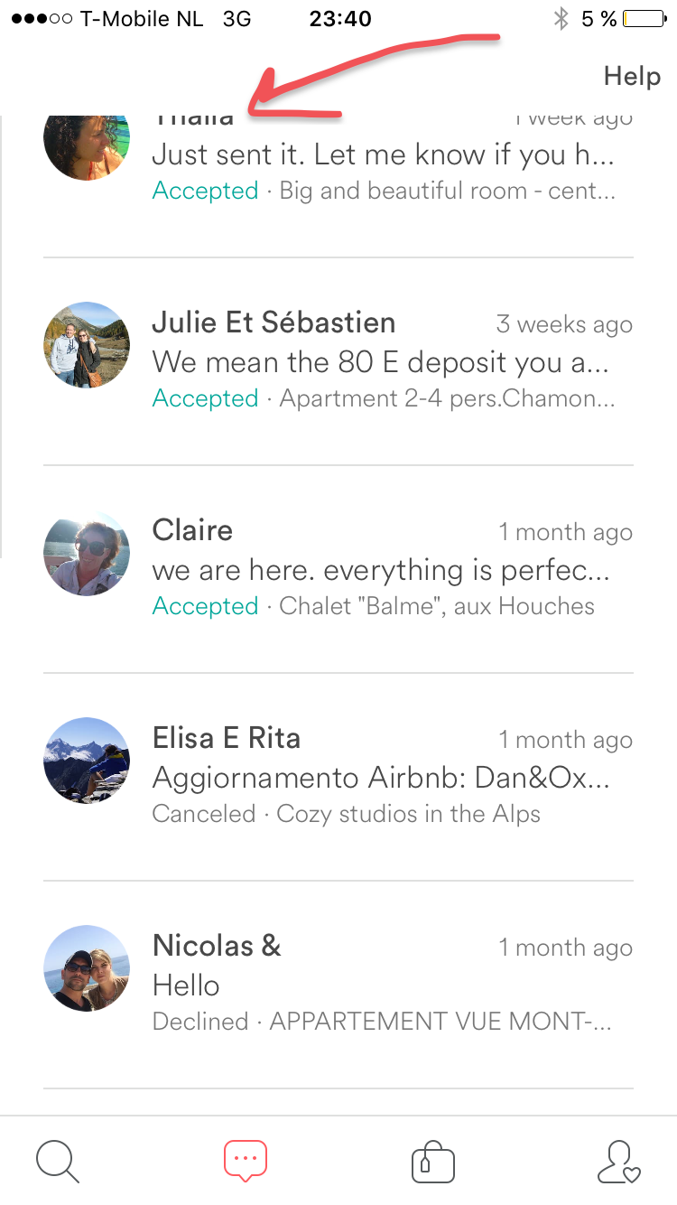
Ok, lets check our conversations. After getting through yet another loading screen we see this:
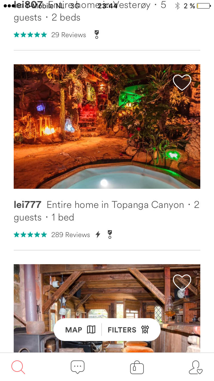
All right, maybe its wrong after you made a booking. But when you're just browsing it's great. Let's try to like something by tapping the heart icon:
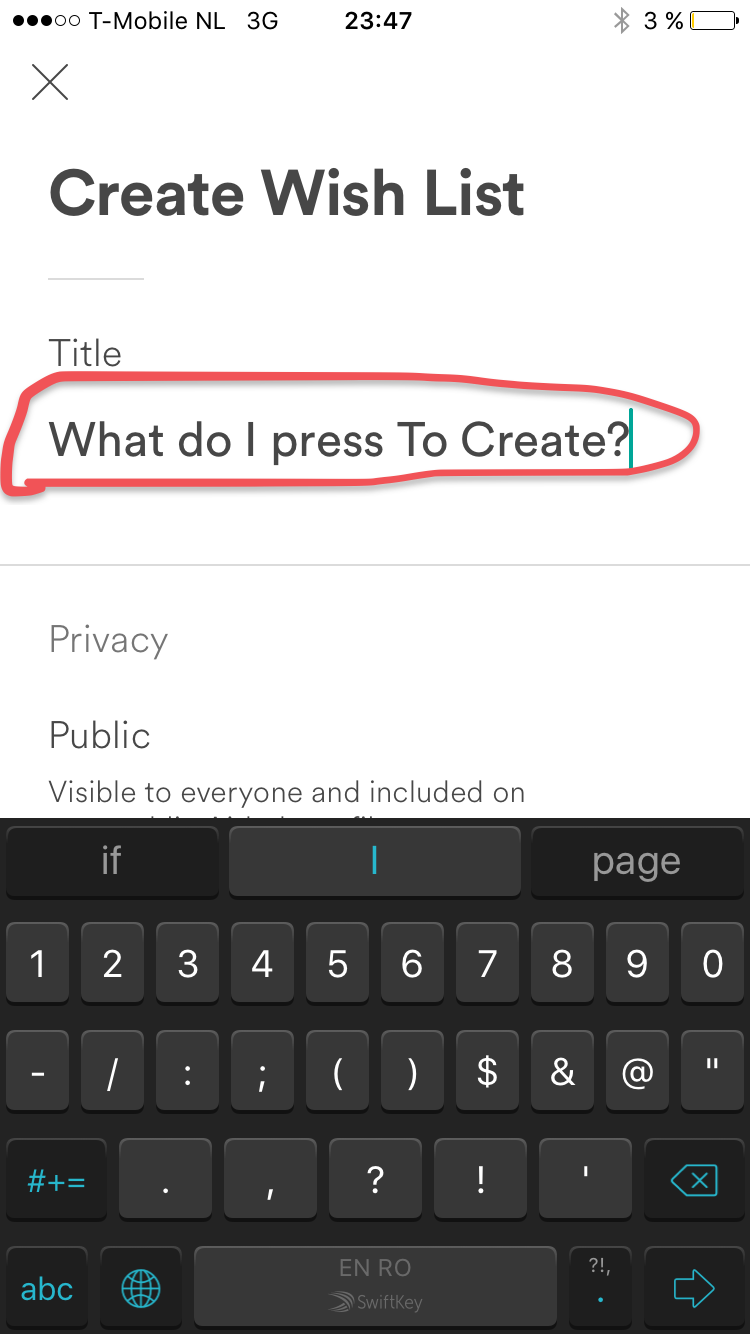
We're not allowed to do that, we can't like (it's actually called Save to wish list). We have to insert some text here. But where is the Create button?
Bummer, it's hidden well under the keyboard. If you try to like something again, you will once more asked to insert some text. I expect to be able to heart things and thats it. Save it to my account somewhere, please.
Now one could say, maybe Apple's Human Interface Guidelines are completely ignored at Airbnb. But performance should not be. Why is it that every View that you try to load takes 2-3 seconds? Why is it that the app is so slow to start, messages are slow to load. When guests are waiting at the door we need real time response times. Why is it that the calendar is insanely slow to load (so you can actually check if your rooms are free?).
There can only be two answers:
1. The iOS Developers working on the Airbnb iOS app are incompetent, unprofessional and ignore every best practice in the community (UI, UX, performance, modularity, scrolling smoothness, even release notes).
2. The technical team wants to but is not allowed or doesn't have the resources to make this app at least acceptable.
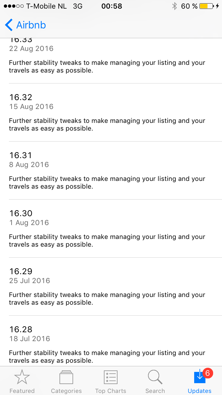
And I saved the best for last. Here is how Airbnb's release notes look like on the AppStore. Oh the irony. They copy paste the same message saying stability tweaks. We saw the tweaks in action:
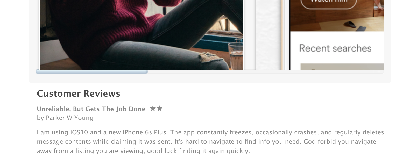
Don't trust a seasoned iOS Developer and regular user? Trust AppStore reviews:
PS: I would like to have a chat with the Airbnb engineers/founders/designers. I would love to help you get out of mess, i've done it before for other iOS apps. I am going to email this blog post to every boss, designer and developer at airbnb that I know of. About time to get this fixed.
